WordPress Rules the Web 👑
I discovered that WordPress powers over 43% of all websites on the internet. Knowing that I am learning the exact same system used by massive brands like Walt Disney and Sony Music gives me a major confidence boost!
No Coding Required 🏠
WordPress acts like a pre-made house kit. Instead of coding every single detail from scratch, it handles the heavy technical lifting so I can focus on building, using simple layouts and blocks.
The Power of Page vs. Post 🗺️
I am creating this permanent “Page” to serve as the static home base for my training. It will act as the perfect hub to track my daily progress as I master this tool.
Block 2: WordPress vs. The Walled Gardens
- Active Theme: Twenty Twenty-Five
- Key Takeaway: WordPress.org gives me full ownership because it’s open source. I’m not trapped by proprietary platforms like Wix or Squarespace.
- The Core Mechanics: Themes handle the visual styling; plugins handle the underlying features and tools.
- Action Completed: Successfully updated the homepage site title from ” home” to Welcome to My Digital Portfolio using the native Heading block.
Block 3: Navigating the WordPress Dashboard
- Dashboard Overview: Learned that Posts are for timely blog content, Pages are for static structure, and Media holds all visual assets. Appearance and Plugins handle design and tools.
- Timestamp Check: Located the “Last Modified” timestamp under the page/post status settings, which tracks exactly when content was last updated.
- Practical Accomplishments:
- Created an empty page titled
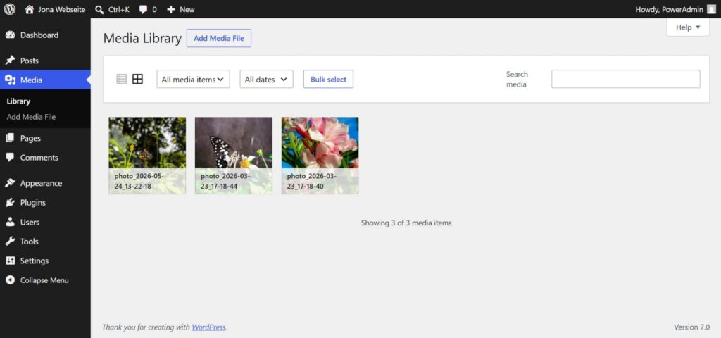
Test Page Block 3. - Successfully uploaded 3 new images to the Media Library.
- Media Library Screenshot:
Block 4: Mastering Typography and Hierarchy
- The Heading Hierarchy: Learned that headings function like an outline ($H1$ for the main title, $H2$ for chapters, $H3$ for sub-topics).
- The Golden Rule: Never use more than one $H1$ per page to keep code clean and search engines happy.
- Practical Accomplishments: Restructured my “About Me” page using a proper hierarchy of $H1$ and $H2$ blocks combined with paragraph text, crossing the 300-word milestone.
💡 Block 4 Insight: Design is Structure
Today I realized that good web design isn’t just about picking pretty colors; it’s about typography and visual hierarchy. When you use headings correctly ($H1 \rightarrow H2 \rightarrow H3$), the page instantly looks like a professional product rather than a messy document. It guides the reader’s eyes naturally through the text, making long pieces of content easy to skim and digest.
My Day 2 Learning Diary
Block 1: Gutenberg vs. Classic Editor
- What I Learned: I learned about the history of WordPress editing and how it shifted from the old Classic Editor—which was just one giant text box—to the modern Gutenberg Block Editor. I learned that Gutenberg breaks everything down into modular “blocks” (like paragraphs, headings, and images) so you can design layouts easily without needing to write HTML code or use complicated shortcodes.
- My Reflection: This makes so much sense to me now. Learning this helps me realize how much faster and easier it is to design modern websites. It gives me the confidence that I can control exactly how a page looks without being a computer programmer.
Block 2: Columns Block & Price List
- What I Learned: I learned how to use the Columns block to break a web page horizontally into equal sections. I practiced inserting a 33 / 33 / 33 layout to make three side-by-side columns. Inside those columns, I learned how to “nest” different blocks sequentially: a Heading for the plan name, a Paragraph for the price, a List for the features, and a Button for the call-to-action.
- My Reflection: Since this is my third time doing this training with Frank, building this practice pricing table using a “Starter, Pro, and VIP” model felt like a major milestone. I realized that keeping the alignment and button styles completely identical across all three columns is what makes a layout look professional instead of messy.
Block 3: Group Block & Containers
- What I Learned: I learned that a Group block acts as a visual container to bundle multiple separate blocks together so you can style them as one unit. I learned how to select my columns, turn them into a Group, and apply a professional light gray background color (
#F5F5F5). I also learned the crucial difference between Padding (adding space inside the container so text doesn’t touch the colored edges) and Margin (adding space outside the container to separate sections - My Reflection: Adjusting the padding was an “aha!” moment for me. Seeing the text instantly look clean and readable just by adding some breathing room made me realize that small details like spacing are what separate a beginner’s website from a professional designer’s work.
Block 4: Image Gallery & Alt Text
- What I Learned: I learned how to use the Gallery block to showcase multiple images in a neat grid rather than just stacking them vertically. I also learned how to use layout settings to add a centered section title, adjust the image Border Radius to 8px for modern soft edges, and keep the background transparent so the colorful images pop. Most importantly, I learned how to write a descriptive, unified English Alt Text that details the product brand, title, and background elements (like aloe vera, sunflowers, and rosemary) for proper e-commerce image SEO and web accessibility.
- My Reflection: Using real product photos like the Human Nature hair care line made this exercise feel so practical for my affiliate marketing goals. Writing the Alt Text in English taught me that every image we upload needs a purpose—it’s not just about making the page look pretty, but about helping Google “read” our products so we can rank higher and get more traffic.
📘 Day 3: WordPress Layouts & Image Optimization Summary
Block 1: Media & Text Block
- Breaks Up Monotone Text: It prevents reader fatigue by ensuring visitors don’t just see a boring wall of text.
- Enhances Visual Storytelling: Pairing an image directly next to a paragraph gives the website a clean, professional, and magazine-like editorial feel.
Block 2 (Cover Block with Text Overlay)
- Creates a Strong Visual Hook: It serves as a striking centerpiece or banner that instantly grabs a visitor’s attention.
- Adds Dynamic Depth: Using the Fixed Background (Parallax Effect) creates a premium 3D scrolling experience, making the website feel modern and high-end.
Block 3 (Gallery Block in a Group)
- Delivers a Balanced Layout: Turning on Crop Images to force a Square (1:1) aspect ratio gives a neat, organized, Instagram-style grid.
- Streamlines Global Styling: Placing the gallery inside a Group block lets you control the margins, spacing, and modern rounded corners (12px Border Radius) of all the images simultaneously instead of editing them one by one.
Block 4 (Image Optimization & AI Generation)
- Boosts Website Loading Speed: Compressing files to under 200KB and using modern formats like WebP keeps the site fast. A fast-loading site is critical for retaining visitors and increasing conversions in digital marketing.
- Provides Infinite Creative Control: Using a structured AI prompt formula allows content creators to generate highly specific, unique, and professional images on-demand, even without access to actual stock photos or a studio setup.
📘 Day 4 Summary: Buttons, Links & Call-to-Actions
1. Core Concept Learned
Today’s focus was on transforming a standard page layout into a professional, high-converting “Contact Me Now” section. I learned how to build visual hierarchy using design dimensions and strategic button placements to guide visitors toward specific business actions.
Breakdown of the 4 Blocks Built
Block 1: Button Styling & Visual Hierarchy
- Designed a multi-button layout featuring distinct styles, colors, and border-radius configurations to separate primary actions from secondary choices.
- Applied consistent, modern web padding configurations (keeping left/right padding double the top/bottom padding) to ensure clean proportions.
Block 2: Technical Link Configuration (Internal vs. External)
- Configured links to operate seamlessly based on user destination.
- Learned that internal links should open in the same tab to keep the user journey unbroken, while external links (like social channels or external communication tools) must be set to open in a new tab so visitors do not leave the website.
Block 3: Crafting Compelling Call-to-Actions (CTAs)
- Replaced generic button text with high-converting, action-oriented verbs.
- Paired clear headlines (“Let’s Work Together”) with copy that sets immediate expectations, creating an inviting portal for professional collaboration.
Block 4: Building the Section Layout
- Combined all text blocks, spacing (whitespace), and button groups inside a multi-column structure.
- Polished the section layout by centering or left-aligning elements and utilizing spacing to make the entire call-to-action area stand out independently on the page.
Technical Implementation Details (My Project Setup)
- Primary Action (Button 1): Solid Teal Fill (
#009688) directing to Telegram for immediate chat inquiries. - Secondary Action (Button 2): Solid Deep Blue Fill (
#1B365D) directing to a TikTok profile to serve as a live video production portfolio. - Business Contact (Button 3): Solid Orange Fill (
#E67E22) utilizing amailto:link format for professional email collaborations.
📓 Day 5 Summary: Colors, Fonts & Design Rules
🧱 Block 1: Create Color Palettes
- Goal: Establish a clean, professional color identity.
- My Palette Choices:
- Heading 2 Text:
#0F172A(Deep slate navy blue) - Paragraph Text:
#334155(Soft, readable dark gray) - Button Background:
#2563EB(Vibrant royal blue) - Button Text:
#FFFFFF(Pure crisp white)
🧱 Block 2: Change Fonts
- Goal: Select a clean typography pairing for the website.
- My Font Choices:
- Headings: A bold, modern Sans-Serif style copied from a fancy text generator to make titles look strong and sharp.
- Body/Paragraph Text: A clean Typewriter/Monospace style to ensure regular sentences are easy to read.
🧱 Block 3: Learn Contrast Rules (Readable Text!)
- Goal: Practice making text stand out perfectly against the background.
- Key Lessons Learned:
- Text Readability: Dark navy and gray text must sit on a crisp white background so visitors don’t strain their eyes.
- Button Pop: High-contrast combinations (like white text on a solid blue button) make actions stand out immediately.
- Breathing Room (Spacing): Added 24px of spacing (breathing room) below the heading to keep the elements looking professional instead of squished.
🧱 Block 4: Global Theme Settings
- Goal: Apply styles across the entire site instead of doing it block-by-block.
- Key Action: Navigated to the global Styles (🌗) menu in the WordPress toolbar to set the site’s permanent foundation.
📝 Learning Diary: Day 6 Summary
Date: June 3, 2026 Focus: Mobile Optimization & First Tests
Block 1: Visual Inspection & Initial Audit
- Action Taken: Switched the WordPress editor view into the mobile simulator to review the layout across the entire portfolio.
- Key Insight: Learned that desktop previews do not show how a site truly looks on a phone, making a strict mobile audit necessary to catch squeezed layouts and awkward text breaks.
Block 2: Spacing & Padding Adjustments
- Action Taken: Mastered the Dimensions panel by unlocking the chain-link icon to edit individual side values. Applied a standard 20px Left and Right padding across all pages.
- Key Insight: Symmetrical padding creates a clean safety buffer that keeps text and images from hitting the sharp glass edges of a phone screen. Discovered that padding controls operate in a clockwise order starting from the top: Top, Right, Bottom, Left.
Block 3: Typography & Element Responsiveness
- Action Taken: Cleaned up the structural flow of the site. Removed large mobile spacers that created awkward gaps, grouped elements together into unified container blocks, and collapsed multi-column image grids into a 1-column vertical stack.
- Key Insight: Single-column stacking is critical for mobile viewports. It allows media to expand to full width, letting visitors appreciate fine photography details without squinting.
Block 4: Functional Testing & Final Review
- Action Taken: Audited all interactive features—including standard navigation, info sections, call-to-action triggers, and vertical pricing tiers.
- Key Insight: Verified that large, vertically stacked action buttons serve as excellent thumb-friendly tap targets, preventing mobile users from accidentally misclicking neighboring links.
📔 Learning Diary: Week 1 Reflection & Day 7 Assignment
🚀 The Big Breakthroughs
- Overcoming Design Glitches: Learned how to troubleshoot layout squishing. When a button stretches vertically like a pill, it means the font size or the side padding is too big for the column width. Dropping the font to
14pxand padding to12px–16pxfixes it instantly. - Creating a Focal Point: Discovered that in a 3-column layout, you shouldn’t make every button look identical. Giving the middle column (the “Pro Showcase”) a vibrant accent background (
#ff6f43) guides the visitor’s eyes straight to the most important offer. - Mobile First Thinking: Realized that what looks spacious on a desktop can look broken on a phone. Keeping padding at a snug
15px–20pxis the absolute sweet spot for mobile displays.
🛠️ My Technical Skills Checklist
1.Structure & Layout
- H1 vs H2 vs H3 Hierarchy: Mastered using only one H1 for the page title, H2s for big section dividers (like “Our Services & Pricing”), and H3s for the individual column packages.
- Side-by-Side Content: Used row alignment containers to cleanly split a section into a half-media, half-text layout for a professional “About Me” section.
- Spacing: Used 50px spacers to give separate blocks room to breathe so the page doesn’t feel cluttered.
2.Styling & Visuals
- Premium Color Palette: Combined a sleek, clean silver background (
#f4f4f6) with dark slate text and a warm orange accent to make the design look cohesive and expensive. - Uniformity: Kept button padding (
12pxtop/bottom) and border radiuses (6px) identical across the page so the branding looks tightly polished.
3.SEO & Accessibility
- Alt Text Discipline: Wrote clear, descriptive alt text for every single image in the gallery and the bio section so the website is searchable and easy for screen-readers to understand.